
Paper
Works
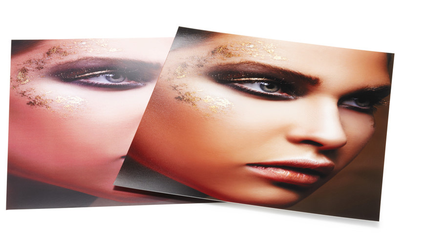
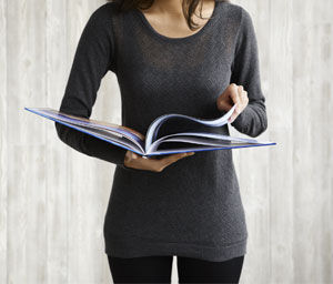
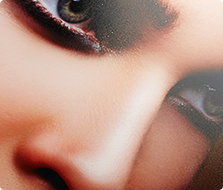
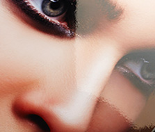
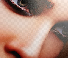
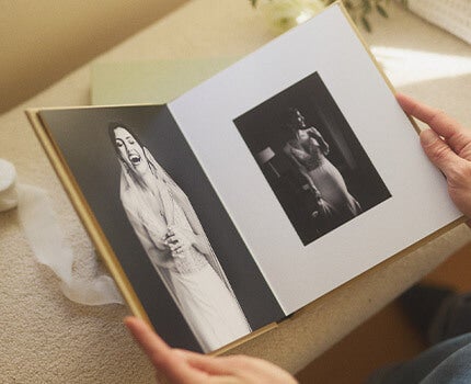
The right paper works wonders. While there’s hard science at work here, the simple reality is: Photographs on high-end photo paper look stunningly better than photographs on non-photo press paper. Colors saturate and leap, contrasts deepen and define, brilliance becomes brighter, emotion is multiplied and delight is amplified.

Chemistry of Delight
There’s chemistry in the paper and the process. There’s also chemistry in your mind as you instantly process the clearly superior images.
Other makers realize the difficulty, expense and level of craftsmanship required to offer photo paper-only books and choose not to. We have a long history of commitment to making great pictures and photo paper is a critical element of great picture-making.

Beauty In The Science
The quality of depth, detail, saturation, contrast, clarity, color authenticity and overall delight factor clearly belongs to AdoramaPix.
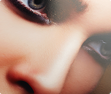
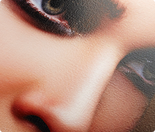
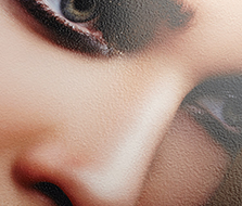
While the example is striking… it’s still a photo of a photo. When you unwrap your photo book, the full impact of photo paper superiority will be overwhelming (in the best possible way).

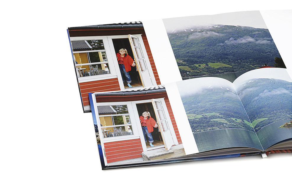
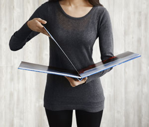
Come Face-To-Face
With Quality
No manipulations, no mirrors and no photo-foolery — just Printique vs. a competitor. All things equal, fair and legitimate.

Paper Perfected.
Paper Preferred.
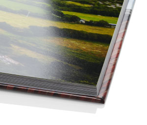
There’s one very important choice that we’ve already made for you: All of our papers are 100% professional-grade photo paper. So you’re already ahead of the pack.
Paper style makes a dramatic difference. Elements like shine level, color saturation and surface texture are just a few factors at work.